How do you make an image responsive using only HTML attributes?
How to make an image responsive using only HTML attributes, along with clean code examples, best-practice notes, and limitations.
✅ How to Make an Image Responsive Using Only HTML Attributes
Traditionally, making images responsive requires CSS (e.g., max-width: 100% and height: auto).
However, if you are restricted to HTML attributes only, you can still make the image scale correctly inside its parent container.
Although HTML alone cannot provide full responsiveness like CSS, two HTML attributes help create a responsive-like behavior:
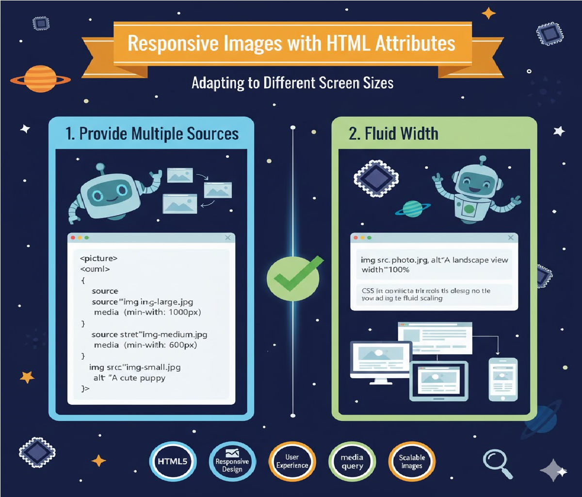
✅ Method 1: Use width="100%" in the <img> Tag
This is the only real HTML-only responsive solution.
✔️ Working Example
<img src="image.jpg" alt="Responsive Image" width="100%">
✔️ Why it works
width="100%"tells the browser: “Make the image always take 100% of its container width.”- The browser automatically keeps the aspect ratio because no
heightis specified. - The image shrinks on small screens and expands on large screens.
✔️ Behavior
- Responsive inside a fluid container (div, section, table cell, etc.)
- Image never stretches beyond its container.
- Height auto-adjusts automatically.
✅ Method 2: Use Both width and height Attributes with Percentage Values
HTML attributes support percent values even though many developers forget it.
✔️ Example
<img src="image.jpg" width="100%" height="auto" alt="Responsive Image">
✔️ How this works
- Width is flexible (
100%of container). - Height auto maintains aspect ratio.
⚠️ Note
Some old browsers may ignore height="auto" as an attribute. Modern browsers support it.
⚠️ What You CANNOT Do with HTML Alone
| Feature | HTML attribute only? | Notes |
|---|---|---|
| Fully fluid responsive image | ✔️ | Using width="100%" |
max-width: 100% equivalent | ❌ | Needs CSS |
| Object-fit / cropping control | ❌ | Needs CSS |
| Lazy loading | ✔️ | loading="lazy" available |
| Responsive picture swapping | ✔️ | Use <picture> and <source> |
✅ Method 3: Use the <picture> Tag for Responsive Variants (HTML Only)
This lets the browser pick a different image per screen size without CSS.
✔️ Example
<picture>
  <source srcset="image-large.jpg" media="(min-width: 800px)">
  <source srcset="image-medium.jpg" media="(min-width: 500px)">
  <img src="image-small.jpg" width="100%" alt="Responsive Image">
</picture>
✔️ Benefits
- More advanced responsiveness using only HTML.
- Browser auto-selects optimized image.
- Work for desktop, tablet, mobile.
🔍 Detailed Long Note Explanation
⭐ Understanding Responsiveness
A responsive image adjusts itself to:
- Screen width
- Container width
- Orientation (portrait/landscape)
- Browser zoom level
HTML alone cannot handle advanced layout rules, but it can fluidly resize an image within its container.
⭐ Why width="100%" is the primary HTML solution
When an image is given a width in percentage:
- Browser calculates width relative to container size.
- Height is scaled proportionally.
- The image becomes “fluid” without warping.
This is exactly what responsive design requires at a basic level.
⭐ Why you should NOT specify height in pixels
If you do this:
<img src="image.jpg" width="100%" height="200">
The image will stretch on wide screens → broken aspect ratio.
📌 Best HTML-Only Responsive Image Practice
<img src="your-image.jpg" alt="Responsive image" width="100%" loading="lazy">
✔️ width="100%" → makes it responsive
✔️ loading="lazy" → performance improvement
✔️ Automatic aspect ratio → no distortion
🧪 Bonus: Responsive Image with Border, Padding, Shadow (Still HTML Only)
You cannot add border/padding with HTML,
but you CAN embed the image inside a table cell or container that has defined sizing:
<table width="100%">
  <tr>
    <td>
      <img src="image.jpg" width="100%" alt="Responsive Image">
    </td>
  </tr>
</table>
Not recommended, but allowed when CSS is restricted.
🎯 Final Answer (One-Line)
To make an image responsive using only HTML attributes, use:
<img src="image.jpg" width="100%" alt="Responsive Image">
This ensures the image scales automatically with its container, maintaining correct aspect ratio without CSS.