How do you make a table header row stick to the top while scrolling?
📌 Introduction
Working with long tables on websites can often make it difficult for users to track which column contains which information, especially when scrolling down. When the table header row scrolls out of view, readers lose context and must scroll up repeatedly to see the column names again. This significantly affects usability, especially in data-heavy dashboards, admin panels, financial reports, and analytics systems. To solve this issue, web developers commonly use a technique called a sticky table header, which keeps the <th> row visible at the top while the table body scrolls underneath.
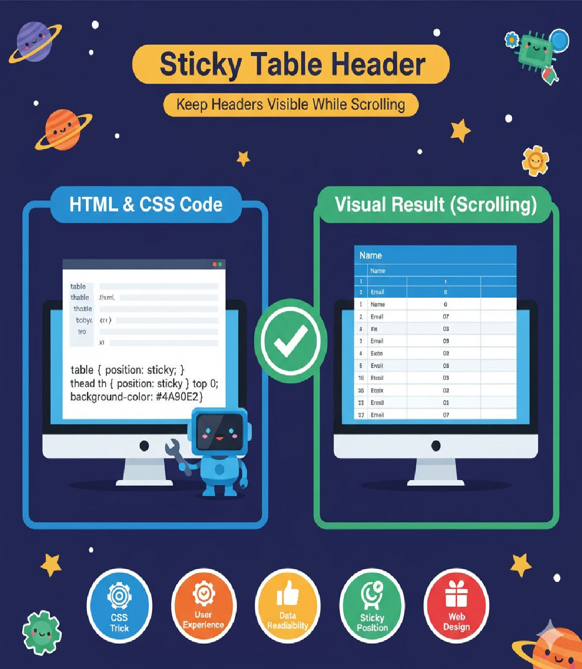
A sticky table header ensures that column labels remain visible at all times during vertical scrolling. The most efficient and modern way to achieve this behavior is by using CSS position: sticky, which is lightweight, highly performant, and does not require JavaScript assistance in most cases.
🔍 Why Sticky Table Headers Are Important
Sticky table headers play a key role in user experience, especially in applications that display large sets of tabular data. Without sticky headers, large tables become difficult to read because users constantly need to scroll back to the top to remember what each column represents. Sticky headers solve this by maintaining the table header row at the top of the viewport or container, allowing users to scroll easily while always seeing the crucial reference information.
Some examples of when sticky table headers are particularly useful include:
- Financial transaction reports
- Attendance sheets
- Employee payroll dashboards
- Inventory management tables
- School grade records
- CRM data tables
- E-commerce product stocks
- Medical or research data logs
Sticky headers enhance readability, improve accessibility, and reduce frustration for end users.
🧪 The Modern CSS Solution
CSS now provides a very simple and highly efficient way to make table headers sticky using position: sticky alongside a top offset. Unlike older approaches (such as absolute positioning hacks or JavaScript scrolling logic), this solution is clean and uses native CSS functionality.
📌 Full Working Example — Sticky Table Header While Scrolling
🔹 HTML
<table class="sticky-table">
  <thead>
    <tr>
      <th>Name</th>
      <th>Age</th>
      <th>Country</th>
    </tr>
  </thead>
  <tbody>
    <tr><td>John</td><td>28</td><td>USA</td></tr>
    <tr><td>Priya</td><td>25</td><td>India</td></tr>
    <tr><td>Michael</td><td>33</td><td>Canada</td></tr>
    <tr><td>Emma</td><td>29</td><td>Australia</td></tr>
    <tr><td>David</td><td>31</td><td>UK</td></tr>
    <!-- Add many rows to test scrolling -->
  </tbody>
</table>
🔹 CSS
.sticky-table {
  width: 100%;
  border-collapse: collapse;
  max-height: 250px;
  display: block;
  overflow-y: scroll;
}

.sticky-table th {
  position: sticky;
  top: 0;
  background: #ffffff;
  z-index: 10;
  padding: 10px;
  border: 1px solid #ccc;
}

.sticky-table td {
  padding: 10px;
  border: 1px solid #ccc;
}
Once this code is applied, the table header row will remain pinned at the top of the scrollable table area, regardless of how far the user scrolls down the table.
🧠 How It Works — Technical Breakdown
To understand why this code creates a sticky header, we need to examine the properties involved:
| Property | Purpose |
|---|---|
display: block on table | Makes table scrollable instead of whole page |
overflow-y: scroll | Allows vertical scrolling inside the table |
max-height | Creates a visible container that scrolls |
position: sticky | Enables element to switch from static to fixed mode |
top: 0 | Locks element to the top of the container |
z-index | Ensures the header stays above other table content |
CSS position: sticky behaves like a hybrid between relative and fixed. It acts normally until the element reaches a defined scroll offset (e.g., top: 0), and then sticks in place.
⭐ Adding Professional UI Enhancements
To improve appearance, UI designers often add a modern header style:
.sticky-table th {
  background: #f7f7f7;
  backdrop-filter: blur(4px);
  box-shadow: 0 2px 4px rgba(0,0,0,0.1);
}
These properties make the header distinct while scrolling.
📱 Making the Sticky Table Header Responsive
Tables often appear messy on small screens, but responsive CSS can solve this:
@media (max-width: 600px) {
  .sticky-table {
    font-size: 14px;
  }
  .sticky-table th, .sticky-table td {
    padding: 8px;
  }
}
This enhances the usability on phones and tablets.
🧩 Sticky Header + Sticky First Column (Advanced)
In some dashboards, both the header row and the first column need to stay fixed. This can be done by combining sticky positioning:
.sticky-table th:first-child,
.sticky-table td:first-child {
  position: sticky;
  left: 0;
  background: #fff;
  z-index: 15;
}
This technique is commonly used in Excel-like tables and schedule displays.
🛠 Optional JavaScript Enhancement
CSS alone is enough, but JavaScript can enhance user experience by adding a dynamic shadow when the user scrolls:
const table = document.querySelector(".sticky-table");
table.addEventListener("scroll", () => {
  document.querySelectorAll("th").forEach(th => {
    th.style.boxShadow = table.scrollTop > 0
      ? "0 2px 4px rgba(0,0,0,0.2)"
      : "none";
  });
});
This gives visual feedback when the header becomes fixed.
🧩 Troubleshooting Guide
| Issue | Cause | Fix |
|---|---|---|
| Header not staying sticky | position: sticky overridden | Remove conflicting CSS like overflow: hidden or position: relative on parents |
| Header overlaps text | Missing z-index | Add z-index: 10 or higher |
| Sticky effect does not work in table layout | Table layout default | Use display: block on table |
| Scroll does not appear | No fixed height | Set height or max-height |
💡 Best Practices
To get the best results when implementing sticky table headers:
- Keep header background opaque so text remains readable
- Avoid heavy shadows that cause distraction
- Keep header height consistent with row height
- Test on mobile devices to ensure proper usability
- Avoid forcing sticky headers if the table has very few rows
🧾 Where Sticky Table Headers Are Widely Used
| Platform | Usage Example |
|---|---|
| Banks | Account statements, transactions |
| Hospitals | Patient history tables |
| Schools | Marksheets and attendance |
| Ecommerce | Stock & product lists |
| Finance | Investment dashboards |
| HR | Hire records and payroll |
| Government | Census and public data |
| SaaS dashboards | Analytics & reports |
Sticky headers aren’t just a design upgrade — they meaningfully improve productivity for users who work with data.
📌 Conclusion
Creating a sticky table header is no longer a complex task that requires JavaScript hacks or tricky absolute positioning. With modern CSS, especially the position: sticky property, a table header can remain visible during scrolling with minimal code, reliable performance, and full browser support in all modern environments.
Developers can further enhance sticky table headers by adding responsive design, UI shading, or even simultaneous sticky columns. Whether it’s for enterprise dashboards, educational records, or financial analytics, sticky headers significantly improve data readability and overall user experience.
📁 Final Summary (Key Code Snippet)
.sticky-table th {
  position: sticky;
  top: 0;
  background: #fff;
  z-index: 10;
}
With just these few lines of CSS, any table header can be made to stay visible while scrolling — clean, simple, and highly effective.