How can you create a sticky navigation bar that remains at the top while scrolling?
•14 min read
Here’s a clear explanation of how to create a sticky navigation bar that stays at the top of the page when the user scrolls — along with clean, working HTML + CSS code.
✅ How to Create a Sticky Navigation Bar While Scrolling
You can create a sticky navbar using CSS position: sticky or position: fixed.
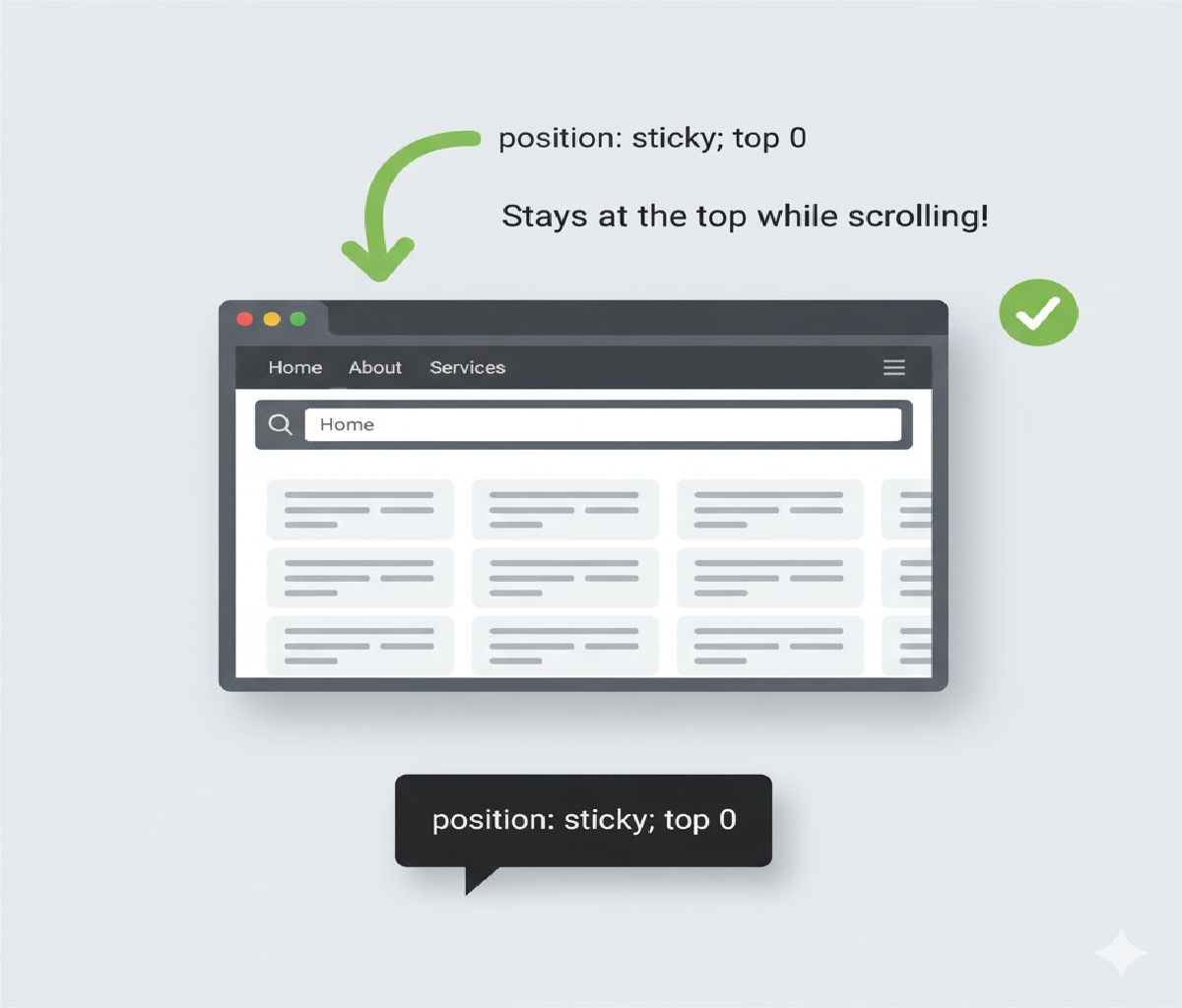
⭐ Method 1: Using position: sticky (Modern & Easy)
The navbar sticks at the top once it reaches that position while scrolling.
✅ HTML
<nav class="sticky-nav">
  <ul>
    <li><a href="#">Home</a></li>
    <li><a href="#">About</a></li>
    <li><a href="#">Services</a></li>
    <li><a href="#">Contact</a></li>
  </ul>
</nav>

<div class="content">
  <p>Scroll down to see the sticky effect...</p>
</div>
✅ CSS
.sticky-nav {
  position: sticky;
  top: 0;
  background: #333;
  padding: 15px;
  z-index: 1000;
}

.sticky-nav ul {
  margin: 0;
  padding: 0;
  list-style: none;
  display: flex;
  gap: 20px;
}

.sticky-nav a {
  color: #fff;
  text-decoration: none;
}
⭐ Method 2: Using position: fixed (Always Stays at Top)
The navbar stays at the top of the screen at all times.
✅ HTML
<nav class="fixed-nav">
  <a href="#">Home</a>
  <a href="#">About</a>
  <a href="#">Blog</a>
  <a href="#">Contact</a>
</nav>

<div class="page-content">
  <h2>Scroll to see the fixed navbar</h2>
</div>
✅ CSS
.fixed-nav {
  position: fixed;
  top: 0;
  left: 0;
  width: 100%;
  background: #222;
  padding: 12px 20px;
  z-index: 1000;
}

.page-content {
  margin-top: 70px; /* Remove overlay issue */
}
☑️ Which should you use?
| Method | When to Use |
|---|---|
position: sticky | For modern websites, sections that stick only after scrolling. |
position: fixed | For navbars that must always stay visible from the start. |


