How do you make a background image cover the entire screen regardless of screen size?
How Do You Make a Background Image Cover the Entire Screen Regardless of Screen Size?
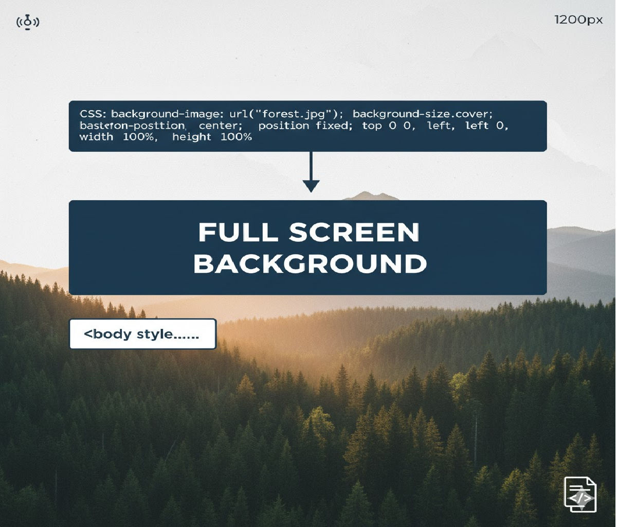
Creating a full-screen background image that always covers the entire viewport — regardless of screen size, resolution, orientation, or device — is one of the most common requirements in modern web design. You see it everywhere: hero sections, landing pages, login screens, portfolio headers, and marketing websites.
In CSS, the most reliable and responsive way to achieve this effect is by using:
background-size: cover;
combined with viewport-based sizing such as:
min-height: 100vh;
or applied directly to the <body> or <html> elements.
In this in-depth guide, we’ll explore:
- The core CSS properties involved
- Step-by-step working examples
- Why
background-size: coverworks - How to center and scale images correctly
- Handling different screen sizes and aspect ratios
- Mobile browser quirks
- Performance best practices
- Accessibility considerations
- Common mistakes and debugging tips
By the end, you’ll be able to build pixel-perfect, responsive full-screen backgrounds confidently.
1. The Core Concept
To make a background image cover the entire screen:
- The container must fill the viewport.
- The background image must scale proportionally.
- No empty gaps should remain.
- The image should stay centered during resizing.
CSS solves this with:
background-size: cover;
background-position: center;
background-repeat: no-repeat;
These three lines handle almost all full-screen background use cases.
2. The Simplest Working Example
Let’s start with the most minimal and commonly used solution.
HTML
<!DOCTYPE html>
<html lang="en">
<head>
<meta charset="UTF-8">
<title>Full Screen Background</title>
<link rel="stylesheet" href="style.css">
</head>
<body>
<div class="content">
<h1>Welcome</h1>
<p>This content sits on top of a full-screen background.</p>
</div>
</body>
</html>
CSS
html, body {
height: 100%;
margin: 0;
}
body {
background-image: url("background.jpg");
background-size: cover;
background-position: center;
background-repeat: no-repeat;
}
What This Does
height: 100%ensures the<body>fills the viewport.background-size: coverscales the image so it completely covers the screen.background-position: centerkeeps the image centered.background-repeat: no-repeatprevents tiling.
This solution works across desktops, tablets, and mobile screens.
3. Understanding background-size: cover
The most important property here is:
background-size: cover;
How It Works
- The image is scaled proportionally.
- The smaller dimension (width or height) is expanded until the container is fully covered.
- The other dimension may overflow and get cropped.
This ensures:
✔ No empty space
✔ No distortion
✔ No stretching
✔ Clean responsive behavior
The trade-off is cropping — but it’s usually preferred over squishing or letterboxing.
4. Alternative: Using a Wrapper Section Instead of Body
Instead of applying the background to the <body>, you can target a hero section or container.
HTML
<section class="hero">
  <div class="hero-content">
    <h1>Full Screen Hero</h1>
    <p>This section always fills the viewport.</p>
  </div>
</section>
CSS
.hero {
  min-height: 100vh;
  background-image: url("hero.jpg");
  background-size: cover;
  background-position: center;
  background-repeat: no-repeat;

  display: flex;
  align-items: center;
  justify-content: center;
  color: white;
}
Why min-height: 100vh?
100vhmeans 100% of the viewport height.min-heightallows the section to grow taller if content exceeds the viewport.
This pattern is ideal for landing page headers and splash sections.
5. Using background Shorthand
You can write the same effect using shorthand:
body {
  background: url("background.jpg") center / cover no-repeat;
}
Breaking it down:
background-image → url("background.jpg")
background-position → center
background-size → cover
background-repeat → no-repeat
This is concise but can be harder to read for beginners.
6. Ensuring Full Coverage on All Devices
Modern devices vary dramatically:
- Ultra-wide monitors
- Portrait phones
- Tablets
- Foldable screens
background-size: cover automatically adapts to all of these.
Example with Media Queries (Optional Enhancements)
body {
  background-image: url("bg-desktop.jpg");
  background-size: cover;
  background-position: center;
  background-repeat: no-repeat;
}

@media (max-width: 768px) {
  body {
    background-image: url("bg-mobile.jpg");
  }
}
This swaps to a lighter or better-cropped image on smaller screens for performance and design consistency.
7. Centering Content on a Full-Screen Background
Often you want text or buttons centered over the background.
HTML
<div class="overlay">
  <h1>Hello World</h1>
  <p>Centered content over a full-screen image.</p>
</div>
CSS
body {
  min-height: 100vh;
  margin: 0;
  background: url("bg.jpg") center / cover no-repeat;

  display: flex;
  align-items: center;
  justify-content: center;
}

.overlay {
  background: rgba(0, 0, 0, 0.5);
  padding: 2rem 3rem;
  border-radius: 12px;
  color: white;
  text-align: center;
}
This creates:
✔ Full-screen image
✔ Centered text block
✔ Readable overlay
All without extra positioning hacks.
8. Adding a Gradient Overlay for Readability
Sometimes background images are too bright or busy for readable text. You can layer a gradient using multiple backgrounds.
body {
  background-image:
    linear-gradient(rgba(0,0,0,0.6), rgba(0,0,0,0.3)),
    url("background.jpg");
  background-size: cover;
  background-position: center;
  background-repeat: no-repeat;
}
Here:
- The gradient darkens the image.
- Text becomes more readable.
- No Photoshop editing required.
9. Using Fixed Backgrounds (Parallax-Like Effect)
To create a subtle parallax illusion:
body {
  background: url("bg.jpg") center / cover no-repeat fixed;
}
What fixed Does
- The background stays in place while content scrolls.
- Creates a depth effect.
⚠ Note: On mobile browsers, background-attachment: fixed is often ignored for performance reasons.
10. Handling Mobile Browser Viewport Quirks
Mobile browsers — especially iOS Safari and Chrome Android — treat viewport height differently because of:
- Address bars
- Toolbars
- Gesture navigation
- Dynamic UI chrome
This can cause 100vh to be taller than visible space.
Safer Alternative Using Modern Units
.hero {
  min-height: 100dvh;
  background: url("hero.jpg") center / cover no-repeat;
}
Where:
dvh= dynamic viewport height- Adjusts when browser UI expands or collapses
Fallback:
.hero {
  min-height: 100vh;
  min-height: 100dvh;
}
Browsers that support dvh will use it; others fall back to vh.
11. Using an <img> Instead of background-image
Sometimes, you want:
- Better SEO
- Native lazy loading
alttext for accessibility
In those cases, you can use an <img> tag styled to behave like a background.
HTML
<div class="bg-wrapper">
  <img src="background.jpg" alt="Scenic landscape" class="bg-image">
  <div class="content">
    <h1>Title</h1>
  </div>
</div>
CSS
.bg-wrapper {
  position: relative;
  min-height: 100vh;
  overflow: hidden;
}

.bg-image {
  position: absolute;
  inset: 0;
  width: 100%;
  height: 100%;
  object-fit: cover;
  object-position: center;
  z-index: -1;
}

.content {
  position: relative;
  color: white;
  padding: 2rem;
}
Equivalent of:
background-size: cover;
background-position: center;
This approach gives you:
✔ Responsive cover behavior
✔ Native image loading features
✔ Better accessibility
12. Common Mistakes and Fixes
❌ Mistake 1: Forgetting to Set Height
body {
background-image: url("bg.jpg");
background-size: cover;
}
This may not fill the screen if the body has no height.
✅ Fix:
html, body {
height: 100%;
}
or
body {
min-height: 100vh;
}
❌ Mistake 2: Using contain Instead of cover
background-size: contain;
This shows the entire image but often leaves gaps.
✅ Use:
background-size: cover;
❌ Mistake 3: Forgetting background-repeat: no-repeat
Without it, small images tile.
✅ Fix:
background-repeat: no-repeat;
❌ Mistake 4: Stretching Images with Width/Height
Avoid:
background-size: 100% 100%;
This distorts the image’s aspect ratio.
Use:
background-size: cover;
13. Comparison: cover vs contain vs 100% 100%
| Value | Behavior | Best Use Case |
|---|---|---|
cover | Fills container, crops excess | Full-screen backgrounds |
contain | Shows entire image, may leave gaps | Logos, illustrations |
100% 100% | Stretches to fit, distorts | Rarely recommended |
For full-screen hero sections and backgrounds, cover is almost always the right choice.
14. Full-Page Layout Example
Here’s a real-world landing page layout using a full-screen background.
HTML
<!DOCTYPE html>
<html lang="en">
<head>
<meta charset="UTF-8">
<title>Landing Page</title>
<link rel="stylesheet" href="styles.css">
</head>
<body>
<header class="hero">
<nav class="navbar">
<h2>Brand</h2>
<ul>
<li><a href="#">Home</a></li>
<li><a href="#">About</a></li>
<li><a href="#">Contact</a></li>
</ul>
</nav>
<div class="hero-content">
<h1>Explore the World</h1>
<p>Your journey starts here.</p>
<button>Get Started</button>
</div>
</header>
</body>
</html>
CSS
* {
box-sizing: border-box;
}
body {
margin: 0;
font-family: Arial, sans-serif;
}
.hero {
min-height: 100vh;
background-image:
linear-gradient(rgba(0,0,0,0.6), rgba(0,0,0,0.3)),
url("travel.jpg");
background-size: cover;
background-position: center;
background-repeat: no-repeat;
display: flex;
flex-direction: column;
justify-content: space-between;
color: white;
}
.navbar {
display: flex;
justify-content: space-between;
align-items: center;
padding: 1rem 2rem;
}
.navbar ul {
list-style: none;
display: flex;
gap: 1.5rem;
margin: 0;
padding: 0;
}
.navbar a {
color: white;
text-decoration: none;
font-weight: bold;
}
.hero-content {
text-align: center;
margin-bottom: 20vh;
}
.hero-content h1 {
font-size: clamp(2rem, 5vw, 4rem);
margin-bottom: 1rem;
}
.hero-content p {
font-size: 1.25rem;
margin-bottom: 2rem;
}
.hero-content button {
padding: 0.75rem 2rem;
border: none;
border-radius: 999px;
font-size: 1rem;
background: #ff9800;
color: white;
cursor: pointer;
}
This gives you:
✔ Full-screen background
✔ Responsive scaling
✔ Readable text
✔ Mobile-friendly layout
15. Performance Best Practices
Full-screen background images are visually powerful but can be heavy.
Best Practices
✔ Use modern formats like WebP or AVIF
✔ Compress images appropriately
✔ Serve different image sizes with media queries
✔ Avoid massive uncompressed JPGs
✔ Use lazy loading when using <img>
✔ Prefer CSS gradients over image overlays
Example:
body {
  background-image:
    linear-gradient(rgba(0,0,0,0.5), rgba(0,0,0,0.5)),
    url("hero.avif");
}
16. Accessibility Considerations
Background images:
- Are decorative
- Cannot contain semantic content
- Are ignored by screen readers
Therefore:
✔ Do not embed important text inside background images
✔ Ensure sufficient color contrast
✔ Use overlays or gradients for readability
✔ Use <img> tags when the image conveys meaning
17. Using CSS Variables for Theming
:root {
  --bg-image: url("default.jpg");
}

.hero {
  min-height: 100vh;
  background: var(--bg-image) center / cover no-repeat;
}
Then dynamically switch themes:
.theme-dark {
  --bg-image: url("dark-theme.jpg");
}
18. JavaScript-Free Responsive Background Swapping
body {
  background-image: url("bg-large.jpg");
  background-size: cover;
  background-position: center;
}

@media (max-width: 768px) {
  body {
    background-image: url("bg-small.jpg");
  }
}
This improves performance on mobile without JavaScript.
19. Final Best Practice Pattern (Production-Ready)
html, body {
  height: 100%;
  margin: 0;
}

body {
  background-image:
    linear-gradient(rgba(0,0,0,0.5), rgba(0,0,0,0.5)),
    url("background.webp");
  background-size: cover;
  background-position: center;
  background-repeat: no-repeat;
}
This:
✔ Works on all screen sizes
✔ Keeps image centered
✔ Avoids tiling
✔ Improves text contrast
✔ Is easy to maintain
20. Summary
To make a background image cover the entire screen regardless of screen size, use:
background-size: cover;
background-position: center;
background-repeat: no-repeat;
min-height: 100vh;
Example
body {
  min-height: 100vh;
  background: url("bg.jpg") center / cover no-repeat;
}


