What’s the difference between fr units and % in CSS Grid layouts?
Below is a complete explanation of the difference between fr units and % percentage units in CSS Grid, with diagrams (text-based), examples, best practices, and real-world use cases.
⭐ Difference Between fr Units and % in CSS Grid Layouts
(Code & Deep Explanation)
CSS Grid offers powerful ways to size columns and rows. Two of the most commonly compared units are:
fr→ fraction of the remaining free space%→ percentage of the total container width
They may look similar, but their behavior is fundamentally different.
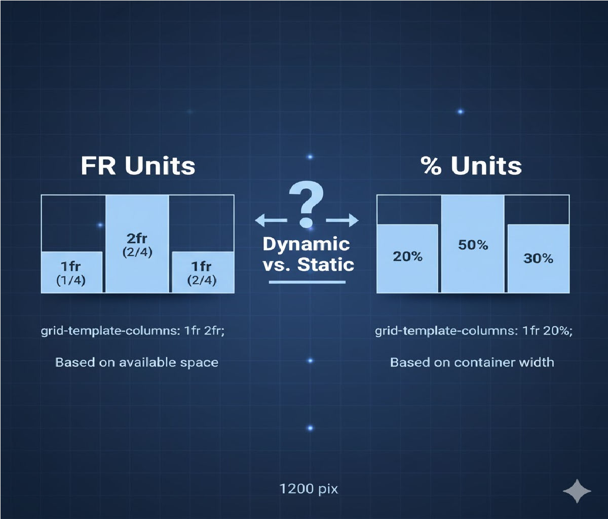
🔵 1. What Is fr in CSS Grid?
fr stands for fractional unit, and it divides the remaining available space inside the grid container after subtracting:
- padding
- border
- gaps
- fixed-width tracks
✔️ Key Features of fr
- Automatically divides leftover space.
- Naturally responsive.
- Adjusts itself even when container size changes.
- Accounts for grid gaps automatically.
- Prevents overflow because it distributes only leftover space.
🧩 Example 1 — Using fr
.grid {
  display: grid;
  grid-template-columns: 1fr 2fr 1fr;
  gap: 20px;
}
🔍 How it works:
Total fr units = 1 + 2 + 1 = 4
- Column 1 → 1/4 of remaining space
- Column 2 → 2/4 (half the width)
- Column 3 → 1/4
The grid automatically subtracts gap and padding, then distributes space.
✔️ Responsive
Works perfectly on all screen sizes without adjustment.
🔶 2. What Is % in CSS Grid?
Percentage (%) units divide the width based on the full container width, not the leftover width.
✔️ Key Features of %
%is strict and does NOT care about gaps or borders.- If columns add up to more than 100%, overflow happens.
- Content inside columns may break the layout.
- Less flexible and less “intelligent” than
fr. - Responsive only in a basic sense.
🧩 Example 2 — Using %
.grid {
  display: grid;
  grid-template-columns: 25% 50% 25%;
}
🔍 Behavior:
- Columns take exactly 25%, 50%, 25% of the container width.
- Grid gaps are not subtracted automatically.
- Risk of overflow if total > 100%.
🟥 3. Technical Difference in Calculation
| Unit | Based On | Considers Gaps? | Flexible? | Risk of Overflow? |
|---|---|---|---|---|
fr | Remaining space | ✔️ Yes | ⭐ Very Flexible | ❌ No |
% | Full container width | ❌ No | ⚠️ Semi-flexible | ✔️ Yes |
🧠 4. Why fr Is Usually Better Than % in Grid
✔️ fr distributes only leftover space
→ No surprises, no overflow.
✔️ % ignores gaps
→ 33% + 33% + 33% + gap = overflow.
✔️ fr naturally scales
→ Perfect for modern responsive layouts.
✔️ % tries to force columns into fixed ratios
→ Old-school responsive design.
🧩 5. Side-by-Side Example (fr vs %)
💙 Using fr
.grid {
  display: grid;
  grid-template-columns: 1fr 1fr 1fr;
  gap: 20px;
}
♥️ Using %
.grid {
  display: grid;
  grid-template-columns: 33% 33% 33%;
  gap: 20px;
}
🔍 Result:
frversion: perfect spacing, grid adapts even with gaps.%version: 99% + gap → overflow, forcing layout to stretch or wrap.
⚙️ 6. Mixing fr with Fixed Units produces intelligent results
Example:
grid-template-columns: 200px 1fr 1fr;<br>- First column is fixed.
- Remaining width is shared equally by the two
frcolumns.
With %, the same layout is harder because the container width changes.
🧱 7. Real-World Analogy
🟦 fr = “Split the leftover pizza equally after removing reserved slices.”
If someone takes a fixed slice (px), the rest gets divided fairly.
🟩 % = “Divide the whole pizza into percentages regardless of who already took some slices.”
If someone takes more or gaps exist, the math breaks.
🚀 8. When to Use Which?
✔️ Use fr when:
- You want a flexible layout
- You don’t want overflow issues
- You use gaps
- You want auto-responsiveness
- You want columns to “share space” logically
✔️ Use % when:
- You need exact, fixed proportional sizing
- You want precise alignment with external designs (e.g., Figma)
- You are recreating old float-based or grid frameworks
📝 9. A Practical Responsive Grid Example
Using fr units
.grid {
  display: grid;
  grid-template-columns: repeat(3, 1fr);
  gap: 20px;
}
On small screens
@media (max-width: 600px) {
  .grid {
    grid-template-columns: 1fr;
  }
}
✔️ Gets perfect responsiveness
✔️ No calculation needed
✔️ No overflow issues


