What CSS technique would you use to create a masonry-like photo gallery?
This guide is suitable for interviews, frontend developers, blogs, tutorials, and SEO articles.
Introduction
A masonry-like photo gallery is a layout style where items of varying heights are arranged in columns, flowing vertically and filling gaps naturally—similar to a brick wall (hence the term masonry). This layout is commonly seen on websites like Pinterest, Unsplash, Instagram feeds, and photography portfolios.
Unlike traditional grid layouts where rows must align horizontally, a masonry layout allows images of different heights to stack naturally, resulting in a visually appealing, space-efficient design.
In modern web development, you can create a masonry-like photo gallery using pure CSS, without JavaScript libraries, by leveraging techniques such as:
- CSS Multi-Column Layout
- CSS Grid (masonry-style simulation)
- New CSS Grid Masonry (experimental)
- Progressive enhancement strategies
This article explains the best CSS techniques, compares them, and shows complete working code examples.
What Is a Masonry Layout?
A masonry layout has these characteristics:
- Variable image heights
- Fixed column widths
- Vertical stacking without large gaps
- Responsive behavior across screen sizes
Traditional Grid vs Masonry
| Traditional Grid | Masonry Layout |
|---|---|
| Fixed rows | No fixed rows |
| Equal height cells | Variable height cells |
| Gaps appear | Space efficiently filled |
| Less organic | More natural and visual |
Best CSS Techniques for Masonry-Like Layouts
✅ Recommended CSS Techniques
- CSS Multi-Column Layout (most widely supported)
- CSS Grid with auto-placement tricks
- CSS Grid Masonry (future-ready, experimental)
Let’s explore each approach in detail.
Technique 1: CSS Multi-Column Layout (Most Popular)
The CSS multi-column layout is the simplest and most widely supported way to create a masonry-like gallery using only CSS.
Why Use Multi-Column Layout?
- Pure CSS (no JavaScript)
- Excellent browser support
- Easy to implement
- Naturally creates masonry flow
Basic HTML Structure
<!DOCTYPE html>
<html lang="en">
<head>
  <meta charset="UTF-8">
  <title>Masonry Gallery</title>
  <link rel="stylesheet" href="style.css">
</head>
<body>

  <h1>Masonry-Like Photo Gallery</h1>

  <div class="masonry">
    <img src="https://picsum.photos/400/300" alt="">
    <img src="https://picsum.photos/400/500" alt="">
    <img src="https://picsum.photos/400/350" alt="">
    <img src="https://picsum.photos/400/600" alt="">
    <img src="https://picsum.photos/400/450" alt="">
    <img src="https://picsum.photos/400/380" alt="">
  </div>

</body>
</html>
CSS for Masonry Using Columns
body {
  font-family: Arial, sans-serif;
  margin: 0;
  padding: 20px;
}

.masonry {
  column-count: 3;
  column-gap: 16px;
}

.masonry img {
  width: 100%;
  margin-bottom: 16px;
  border-radius: 8px;
  display: block;
}
How This Works
column-countdefines the number of vertical columns- Items flow top to bottom, then left to right
- Each image maintains its natural height
- Gaps are minimized automatically
Making It Responsive
@media (max-width: 900px) {
  .masonry {
    column-count: 2;
  }
}

@media (max-width: 500px) {
  .masonry {
    column-count: 1;
  }
}
✅ Pros
✔ Simple and clean
✔ Fully responsive
✔ No JavaScript
✔ Excellent browser support
❌ Cons
✘ No strict row control
✘ Reading order may differ visually
✘ Harder to place overlays consistently
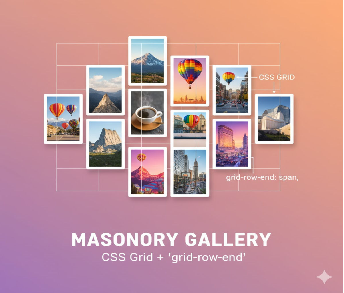
Technique 2: CSS Grid Masonry-Like Layout (Simulation)
CSS Grid does not natively support masonry in stable browsers yet, but you can simulate a masonry effect.
HTML Structure
<div class="grid">
  <div class="item"><img src="https://picsum.photos/400/300"></div>
  <div class="item"><img src="https://picsum.photos/400/500"></div>
  <div class="item"><img src="https://picsum.photos/400/350"></div>
  <div class="item"><img src="https://picsum.photos/400/600"></div>
</div>
CSS Grid Masonry Simulation
.grid {
  display: grid;
  grid-template-columns: repeat(auto-fill, minmax(250px, 1fr));
  grid-auto-rows: 10px;
  gap: 16px;
}

.item img {
  width: 100%;
  border-radius: 8px;
}

.item {
  grid-row: span 30;
}
⚠️ This approach requires manual row spans or JavaScript assistance to calculate heights accurately.
✅ Pros
✔ Strong layout control
✔ Better alignment options
✔ Works well with overlays
❌ Cons
✘ Not true masonry
✘ Requires calculations
✘ More complex
Technique 3: CSS Grid Masonry (Experimental – Future Ready)
The CSS Working Group has introduced native masonry support for Grid.
Experimental Syntax
.masonry {
  display: grid;
  grid-template-columns: repeat(auto-fill, minmax(250px, 1fr));
  grid-template-rows: masonry;
  gap: 16px;
}
⚠️ Support is currently limited (behind flags in some browsers).
When to Use This?
- Experimental projects
- Progressive enhancement
- Future-proof demos
Accessibility Considerations
When creating masonry galleries:
✔ Always include alt text for images
✔ Maintain logical DOM order
✔ Avoid purely visual information
✔ Ensure keyboard navigation
Example:
<img src="photo.jpg" alt="Mountain landscape during sunset">
Performance Best Practices
Lazy Loading Images
<img src="photo.jpg" loading="lazy" alt="Gallery image">
Use Optimized Image Sizes
- Serve responsive images
- Use modern formats (WebP)
SEO Considerations for Masonry Galleries
✔ Use descriptive alt text
✔ Wrap gallery in semantic HTML
✔ Avoid layout shift (CLS)
✔ Maintain readable DOM order
Comparison: CSS Masonry Techniques
| Technique | Best Use Case |
|---|---|
| Multi-Column Layout | Blogs, galleries, portfolios |
| CSS Grid Simulation | Apps, dashboards |
| Native Grid Masonry | Future-ready projects |
Common Mistakes to Avoid
❌ Using tables or floats
❌ Heavy JavaScript libraries unnecessarily
❌ Ignoring mobile responsiveness
❌ Forgetting accessibility
❌ Large unoptimized images
Real-World Use Cases
- Photography portfolios
- Image-heavy blogs
- Product galleries
- Inspiration boards
- Social feeds
Interview Answer (Short Version)
“To create a masonry-like photo gallery, I would use the CSS multi-column layout technique because it allows variable-height items to flow naturally without JavaScript. For advanced layouts, I may use CSS Grid masonry or simulate masonry using grid auto-rows.”
Conclusion
The best CSS technique to create a masonry-like photo gallery today is the CSS multi-column layout, thanks to its simplicity, browser support, and natural masonry behavior.
CSS Grid offers more control and future-ready native masonry, but multi-column layout remains the most practical and production-ready solution.
By combining:
- CSS columns
- Responsive media queries
- Lazy loading
- Accessibility best practices
You can build modern, performant, and visually stunning masonry galleries using pure CSS.


