What CSS property would you use to create a gradient background that transitions smoothly between colors?
What CSS Property Creates a Smooth Gradient Background?
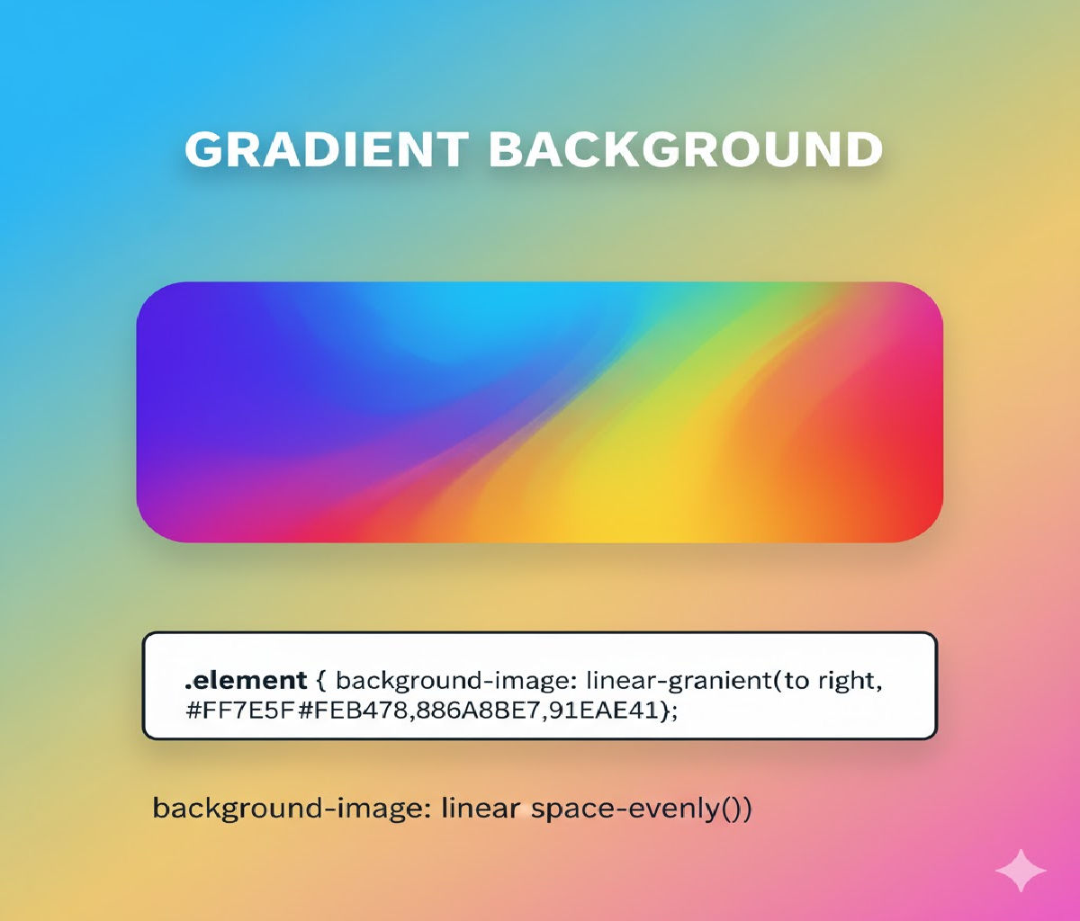
The CSS property used to create smooth color transitions in backgrounds is:
background
or more specifically:
background-image
with gradient functions, such as:
linear-gradient()radial-gradient()conic-gradient()repeating-linear-gradient()repeating-radial-gradient()
Gradients in CSS are treated as images and are generated by the browser at runtime, meaning they scale perfectly on any screen size without pixelation.
1. Why Use CSS Gradients Instead of Images?
Before CSS gradients existed, designers relied heavily on image files for backgrounds. That approach caused several problems:
| Issue | Impact |
|---|---|
| Large file sizes | Slower page loads |
| Fixed resolution | Poor scaling on high-DPI screens |
| No animation | Static visuals |
| Hard to maintain | Design changes require image editing |
CSS gradients solve all of these:
✅ Lightweight
✅ Fully responsive
✅ Infinitely scalable
✅ Animatable
✅ Customizable via code
2. Basic Syntax of CSS Gradients
Gradients are written as values to background or background-image.
Basic structure:
background: linear-gradient(direction, color-stop1, color-stop2, ...);
Example:
background: linear-gradient(to right, red, blue);
This creates a smooth horizontal transition from red to blue.
3. Linear Gradients (Most Common)
📌 Definition
A linear gradient transitions colors along a straight line — vertically, horizontally, or diagonally.
✔ Basic Example
<div class="box"></div>
.box {
  width: 300px;
  height: 150px;
  background: linear-gradient(to right, #ff512f, #dd2476);
}
📌 Result: A smooth blend from coral red to pink horizontally.
4. Understanding Directions in Linear Gradients
Directions control the angle of color flow.
| Direction Syntax | Meaning |
|---|---|
to bottom | Top → bottom |
to right | Left → right |
to bottom right | Diagonal |
45deg | 45° clockwise from vertical |
Example:
.box {
  background: linear-gradient(45deg, purple, orange);
}
This produces a diagonal gradient from bottom-left to top-right.
5. Using Multiple Color Stops
Gradients are not limited to two colors — you can use as many as you want.
.box {
  background: linear-gradient(to right, red, yellow, green, cyan, blue);
}
Each color smoothly blends into the next.
6. Controlling Color Stop Positions
You can specify where each color appears using percentages or lengths.
.box {
  background: linear-gradient(to right, red 0%, yellow 40%, green 100%);
}
This means:
- Red fills 0–40%
- Yellow transitions to green by 100%
This allows fine control over visual emphasis.
7. Radial Gradients
📌 Definition
A radial gradient radiates outward from a center point.
Basic Example:
.circle {
  width: 200px;
  height: 200px;
  border-radius: 50%;
  background: radial-gradient(circle, gold, crimson);
}
This creates a circular glow effect.
8. Radial Gradient Shapes and Sizes
You can control shape and size:
background: radial-gradient(ellipse at top left, red, blue);
Or:
background: radial-gradient(circle closest-side, yellow, black);
Size keywords include:
closest-sideclosest-cornerfarthest-sidefarthest-corner
9. Conic Gradients (Modern CSS)
📌 Definition
A conic gradient rotates colors around a central point like a pie chart or color wheel.
Example:
.spinner {
  width: 200px;
  height: 200px;
  border-radius: 50%;
  background: conic-gradient(red, yellow, green, cyan, blue, magenta, red);
}
Perfect for charts, loaders, and decorative effects.
10. Repeating Gradients
Repeating gradients allow patterns:
background: repeating-linear-gradient(
  45deg,
  #222,
  #222 10px,
  #fff 10px,
  #fff 20px
);
This creates diagonal stripes.
11. Using Gradients with Multiple Background Layers
CSS allows stacking multiple background layers:
.card {
  background:
    linear-gradient(to bottom, rgba(0,0,0,0.4), rgba(0,0,0,0.1)),
    url("image.jpg");
  background-size: cover;
}
This overlays a gradient on an image — very useful for text contrast.
12. Animating Gradients
Gradients can be animated using background position or background size.
Example — Animated Gradient Background:
<div class="animated-bg">Welcome</div>
.animated-bg {
  width: 300px;
  height: 150px;
  color: white;
  font-size: 24px;
  display: flex;
  align-items: center;
  justify-content: center;
  background: linear-gradient(270deg, #ff512f, #dd2476, #24c6dc, #514a9d);
  background-size: 600% 600%;
  animation: gradientMove 8s ease infinite;
}

@keyframes gradientMove {
  0% { background-position: 0% 50%; }
  50% { background-position: 100% 50%; }
  100% { background-position: 0% 50%; }
}
This produces a smooth, flowing gradient animation — commonly used in hero banners.
13. Accessibility Considerations
Gradients look beautiful, but accessibility matters:
✔ Ensure sufficient contrast between text and background
✔ Avoid overly busy gradients behind text
✔ Use overlays when needed
Example:
.hero {
  background:
    linear-gradient(rgba(0,0,0,0.5), rgba(0,0,0,0.5)),
    linear-gradient(to right, #00c6ff, #0072ff);
  color: white;
}
This dark overlay improves readability.
14. Real-World UI Examples
🔹 Buttons
.button {
  padding: 12px 24px;
  color: white;
  border: none;
  border-radius: 6px;
  background: linear-gradient(to right, #ff416c, #ff4b2b);
}
🔹 Cards
.card {
  width: 280px;
  padding: 20px;
  border-radius: 12px;
  background: linear-gradient(135deg, #667eea, #764ba2);
  color: white;
}
🔹 Page Backgrounds
body {
  margin: 0;
  min-height: 100vh;
  background: radial-gradient(circle at top, #1e3c72, #2a5298);
}
🔹 Progress Bars
.progress {
  height: 20px;
  width: 100%;
  background: linear-gradient(to right, #00f260, #0575e6);
}
15. Vendor Prefixes and Browser Support
Modern browsers support gradients natively, but historically vendor prefixes were required:
background: -webkit-linear-gradient(left, red, blue);
background: -moz-linear-gradient(left, red, blue);
background: linear-gradient(to right, red, blue);
Today, the unprefixed version works in all major browsers (Chrome, Edge, Firefox, Safari).
16. Performance Considerations
CSS gradients are:
- GPU accelerated
- Memory efficient
- Resolution independent
However:
- Excessive animations can impact battery life
- Avoid animating too many gradient elements simultaneously
Best practice: animate only hero sections or key UI components.
17. Gradients vs Solid Colors vs Images
| Feature | Solid Color | Gradient | Image |
|---|---|---|---|
| File size | None | None | Yes |
| Visual depth | Low | High | High |
| Responsive scaling | Perfect | Perfect | Often distorted |
| Animation | Limited | Excellent | Difficult |
Gradients strike the best balance between aesthetics and performance.
18. Combining Gradients with CSS Variables
Modern CSS allows dynamic theming using custom properties:
:root {
  --start-color: #ff512f;
  --end-color: #dd2476;
}

.box {
  background: linear-gradient(to right, var(--start-color), var(--end-color));
}
Switching themes becomes trivial.
19. Practical Mini Project — Gradient Hero Section
<section class="hero">
  <h1>Welcome to My Site</h1>
  <p>Beautiful gradients using pure CSS</p>
</section>
.hero {
  min-height: 60vh;
  display: flex;
  flex-direction: column;
  align-items: center;
  justify-content: center;
  text-align: center;
  color: white;
  background: linear-gradient(135deg, #1d2671, #c33764);
}

.hero h1 {
  font-size: 3rem;
}

.hero p {
  font-size: 1.2rem;
}
This demonstrates how gradients enhance modern UI design without external assets.


