How would you reorder grid items on mobile without changing the HTML structure?
How to Reorder Grid Items on Mobile Without Changing HTML
Modern CSS Grid allows you to visually rearrange items using CSS only, without touching the HTML structure.
This is extremely useful for responsive layouts, especially when mobile layouts require a different order than desktop.
You don’t need JavaScript.
You don’t need to move elements in the DOM.
You only need CSS.
✅ Method 1 — Using grid-template-areas (Best & Most Flexible)
With grid-template-areas, you can redefine the layout for different screen sizes simply by changing the grid arrangement inside a media query.
✔ Step-by-step logic:
- Assign each grid item a grid-area name.
- For desktop, define a normal layout.
- For mobile, redefine the template areas in the order you want.
✔ Example Code
HTML (unchanged):
<div class="grid">
  <div class="item1">Header</div>
  <div class="item2">Sidebar</div>
  <div class="item3">Content</div>
  <div class="item4">Footer</div>
</div>
Desktop Layout (Default CSS):
.grid {
  display: grid;
  grid-template-areas:
    "header header"
    "sidebar content"
    "footer footer";
  gap: 10px;
}

.item1 { grid-area: header; }
.item2 { grid-area: sidebar; }
.item3 { grid-area: content; }
.item4 { grid-area: footer; }
Mobile Reordered Layout (CSS Only):
@media (max-width: 600px) {
  .grid {
    grid-template-areas:
      "header"
      "content"
      "sidebar"
      "footer";
  }
}
✔ What changed?
Only CSS.
Now, on mobile:
- Header
- Content
- Sidebar
- Footer
No HTML modification needed.
🟩 Why Grid Template Areas Is the Best Approach
- Super readable
- Makes layout visually easy to plan
- Keeps HTML clean
- Ideal for full control over ordering
- Works for any grid configuration
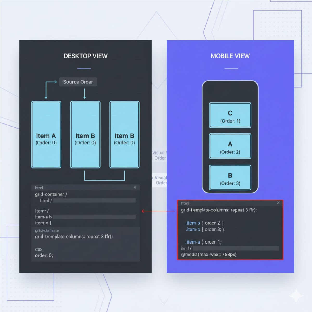
✅ Method 2 — Using order Property (Simpler but Limited)
If you’re using display:grid, you can still assign an order to individual grid items (just like flexbox).
✔ Example Code
HTML stays the same
<div class="grid">
  <div class="item1">Header</div>
  <div class="item2">Sidebar</div>
  <div class="item3">Content</div>
  <div class="item4">Footer</div>
</div>
Desktop Default (no order applied)
.grid {
  display: grid;
  grid-template-columns: 1fr 1fr;
  gap: 10px;
}
Mobile Reordering using order:
@media (max-width: 600px) {
  .item1 { order: 1; }
  .item3 { order: 2; }
  .item2 { order: 3; }
  .item4 { order: 4; }

  .grid {
    grid-template-columns: 1fr;
  }
}
✔ Result (mobile order):
- Header
- Content
- Sidebar
- Footer
🔥 Method 3 — Using grid-column and grid-row
You can manually place items using rows & columns in mobile view.
✔ Example:
@media (max-width: 600px) {
  .item1 { grid-row: 1; }
  .item3 { grid-row: 2; }
  .item2 { grid-row: 3; }
  .item4 { grid-row: 4; }

  .grid {
    grid-template-columns: 1fr;
  }
}
This gives you pixel-perfect control, but is more manual.
🧠 When to Use Each Method
| Method | Best for | Difficulty | Notes |
|---|---|---|---|
| grid-template-areas | Complex responsive layouts | Easy | Recommended |
| order | Simple reordering | Very Easy | Fastest solution |
| grid-row/column | Complex manual placement | Medium | More code required |
⭐ Long Explanation Summary
To reorder grid items on mobile without modifying the HTML structure, CSS Grid provides multiple responsive techniques. The most powerful method is using grid-template-areas, which allows you to redefine your layout visually through CSS alone. By assigning each grid item a named area and then redefining the arrangement inside a mobile media query, you can completely rearrange item order without touching your markup. Another option is to use the order property, similar to Flexbox, which lets you rearrange items numerically, though it's better suited for simpler layouts. A third method uses manual placement through grid-row and grid-column, giving precise control but requiring more code. All these methods enable responsive rearrangement while keeping your HTML clean and untouched.


