How do you create a border that only appears on hover without shifting layout?
How to Create a Border That Only Appears on Hover Without Shifting Layout
When designing interactive user interfaces, it’s common to highlight elements like buttons, cards, images, or links when users hover over them. A popular visual effect is adding a border on hover. However, if you simply apply a border in the :hover state, it often causes the element to grow slightly in size, pushing surrounding content and creating an annoying “layout shift.”
This article explains why that happens, and then walks through multiple professional techniques to create hover borders that look smooth, polished, and don’t affect layout — complete with real-world code examples.
🔍 Why Borders Cause Layout Shifts
In CSS, the default box model calculates an element’s total size as:
Total width = width + padding + border + margin
Total height = height + padding + border + margin
So when you add a border only on hover:
.box:hover {
  border: 2px solid blue;
}
…the element suddenly becomes 4px wider and taller (2px on each side). That forces neighboring elements to move, resulting in a layout shift.
To avoid this, we must either:
- Reserve the space for the border in advance, or
- Create the border visually without changing the element’s box size
Let’s explore all the best approaches in depth.
✅ Method 1: Use a Transparent Border by Default (Most Common)
Concept
Give the element a border from the start, but make it transparent. On hover, just change the color. Since the border already occupies space, the layout doesn’t change.
Example
HTML
<button class="btn">Hover Me</button>
CSS
.btn {
  padding: 12px 20px;
  font-size: 16px;
  background: white;
  border: 2px solid transparent; /* Reserve space */
  border-radius: 6px;
  cursor: pointer;
  transition: border-color 0.2s ease;
}

.btn:hover {
  border-color: #007bff;
}
Why It Works
- The border is always there — it’s just invisible.
- On hover, only the color changes, not the dimensions.
- Smooth transition possible with
transition.
When to Use
✔ Buttons
✔ Input fields
✔ Cards in grids
✔ Anywhere consistent sizing matters
This is the simplest and most widely used solution.
✅ Method 2: Use box-sizing: border-box
Concept
By default, CSS uses content-box. If you switch to border-box, borders are included inside the element’s declared width and height, preventing growth when a border is added.
Example
HTML
<div class="card">Hover me</div>
CSS
.card {
  width: 200px;
  height: 120px;
  padding: 16px;
  background: #f5f5f5;
  border-radius: 8px;
  box-sizing: border-box;
  transition: border 0.2s ease;
}

.card:hover {
  border: 3px solid #4caf50;
}
Why It Works
- The border is drawn inward.
- The element’s outer dimensions stay fixed.
Caveats
- Content area shrinks slightly when border appears.
- Less ideal for text-heavy components.
When to Use
✔ Fixed-size components
✔ Cards with known dimensions
✔ Layouts where outer size must remain constant
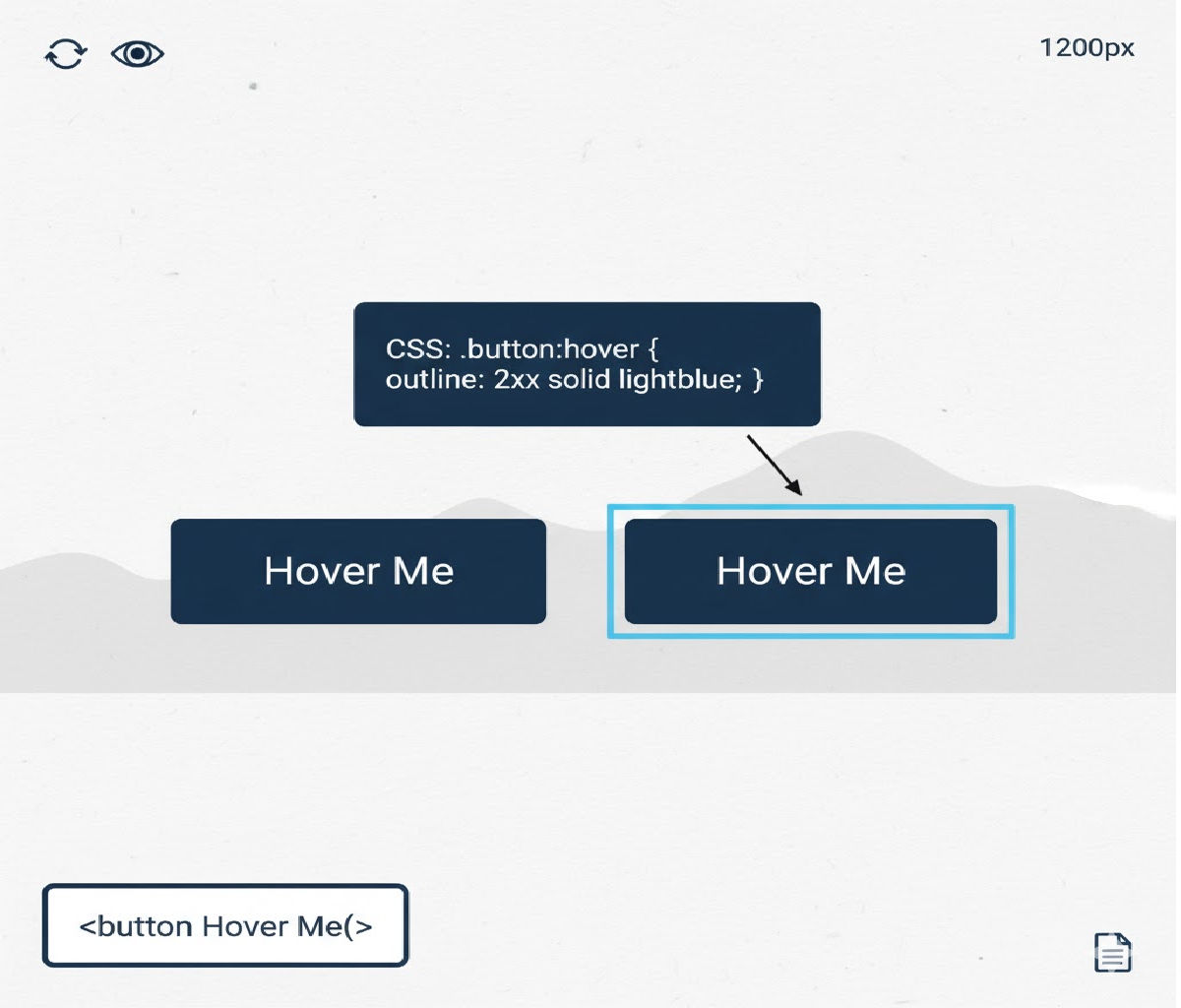
✅ Method 3: Use outline Instead of border
Concept
CSS outline does not take up space in the box model, so it never causes layout shifts.
Example
HTML
<button class="outline-btn">Hover Me</button>
CSS
.outline-btn {
  padding: 12px 20px;
  background: #fff;
  border: none;
  border-radius: 6px;
  font-size: 16px;
  cursor: pointer;
  transition: outline 0.2s ease;
}

.outline-btn:hover {
  outline: 2px solid #ff5722;
}
Why It Works
- Outlines are drawn outside the element’s box.
- They don’t affect layout or sizing.
Limitations
- Outlines don’t respect
border-radiusin all browsers. - Styling options are limited (no side-specific outlines).
- Can overlap nearby elements visually.
When to Use
✔ Accessibility focus styles
✔ Simple hover effects
✔ Forms and inputs
✅ Method 4: Use box-shadow to Simulate a Border
Concept
A zero-blur box-shadow can act like a border but doesn’t change layout.
Example
HTML
<div class="shadow-box">Hover me</div>
CSS
.shadow-box {
  width: 180px;
  padding: 16px;
  background: #fafafa;
  border-radius: 8px;
  transition: box-shadow 0.2s ease;
}

.shadow-box:hover {
  box-shadow: 0 0 0 2px #673ab7;
}
How It Works
- The syntax
0 0 0 2px colorcreates a solid outline-like ring. - Doesn’t affect element dimensions.
Advantages
✔ Respects border-radius
✔ Highly customizable
✔ Smooth animation
When to Use
✔ Cards
✔ Images
✔ Interactive panels
This is a favorite technique in modern UI systems like Material UI and Tailwind-based designs.
✅ Method 5: Use a ::before or ::after Pseudo-Element
Concept
Create a positioned pseudo-element that looks like a border and toggle its opacity or scale on hover — without changing layout.
Example
HTML
<div class="pseudo-card">Hover me</div>
CSS
.pseudo-card {
  position: relative;
  padding: 16px;
  background: white;
  border-radius: 10px;
  overflow: hidden;
}

.pseudo-card::after {
  content: "";
  position: absolute;
  inset: 0;
  border: 2px solid #2196f3;
  border-radius: inherit;
  opacity: 0;
  transition: opacity 0.2s ease;
  pointer-events: none;
}

.pseudo-card:hover::after {
  opacity: 1;
}
Why It Works
- The pseudo-element is absolutely positioned.
- It overlays the border visually without affecting layout.
Advantages
✔ Full control over animation
✔ Works with gradients and fancy borders
✔ No layout shift ever
When to Use
✔ Advanced UI effects
✔ Animated borders
✔ Gradient or glowing outlines
✅ Method 6: Use background-clip and Padding Tricks
Concept
You can simulate a border by using multiple backgrounds and background-clip, toggling the outer background on hover.
Example
HTML
<div class="bg-border">Hover me</div>
CSS
.bg-border {
  padding: 16px;
  border-radius: 8px;
  background:
    linear-gradient(white, white) padding-box,
    linear-gradient(90deg, transparent, transparent) border-box;
  border: 2px solid transparent;
  transition: background 0.3s ease;
}

.bg-border:hover {
  background:
    linear-gradient(white, white) padding-box,
    linear-gradient(90deg, #ff9800, #ff5722) border-box;
}
Why It Works
- Border area is simulated using the background layer.
- The actual border is transparent and always present, so no shift.
When to Use
✔ Gradient borders
✔ Fancy UI cards
✔ Marketing components
🔥 Comparing the Techniques
| Method | Layout Safe | Rounded Corners | Customizable | Best Use |
|---|---|---|---|---|
| Transparent border | ✅ | ✅ | Medium | Buttons, forms |
box-sizing: border-box | ✅ | ✅ | Medium | Fixed-size cards |
outline | ✅ | ❌ (limited) | Low | Accessibility, quick effects |
box-shadow | ✅ | ✅ | High | Cards, images |
| Pseudo-element | ✅ | ✅ | Very high | Advanced animations |
| Background-clip trick | ✅ | ✅ | Very high | Gradient borders |
🧠 Best Practice Recommendation
In most real-world projects, the best default solution is:
✅ Use a transparent border in the normal state and change only the color on hover
It’s simple, accessible, predictable, and works in every browser.
Example:
.element {
  border: 2px solid transparent;
  transition: border-color 0.2s ease;
}

.element:hover {
  border-color: #2196f3;
}
For more advanced UI design systems, box-shadow or pseudo-elements provide greater visual flexibility.
🎯 Real-World Example: Hover Border for Card Grid (No Layout Shift)
Let’s build a small card grid UI that uses the box-shadow technique for a polished hover effect.
HTML
<div class="grid">
  <div class="card">Card One</div>
  <div class="card">Card Two</div>
  <div class="card">Card Three</div>
</div>
CSS
.grid {
  display: grid;
  grid-template-columns: repeat(auto-fit, minmax(160px, 1fr));
  gap: 16px;
}

.card {
  padding: 20px;
  background: white;
  border-radius: 12px;
  box-shadow: 0 0 0 0 transparent;
  transition: box-shadow 0.25s ease, transform 0.2s ease;
}

.card:hover {
  box-shadow: 0 0 0 2px #3f51b5;
  transform: translateY(-2px);
}
Result
- Cards lift slightly on hover.
- A clean border appears.
- No layout shift.
- Smooth, modern feel.
⚠️ Common Mistakes to Avoid
❌ Adding border only on hover
.bad:hover {
  border: 2px solid red;
}
Causes layout jump — avoid this.
❌ Using margins to fake borders
Margins affect layout and spacing — not ideal for hover effects.
❌ Forgetting transitions
Instant borders feel jarring. Always add transitions:
transition: border-color 0.2s ease;
or
transition: box-shadow 0.2s ease;
♿ Accessibility Considerations
- Hover-only effects should not be the sole indicator of interactivity.
- Always add equivalent
:focusstyles for keyboard users:
.element:hover,
.element:focus-visible {
  border-color: #2196f3;
}
- Ensure sufficient contrast between the border and background.
🧪 Advanced Example: Animated Gradient Border on Hover (No Shift)
Using pseudo-elements:
HTML
<button class="glow-btn">Hover Me</button>
CSS
.glow-btn {
  position: relative;
  padding: 12px 24px;
  font-size: 16px;
  background: #111;
  color: white;
  border-radius: 10px;
  border: none;
  cursor: pointer;
  z-index: 0;
  overflow: hidden;
}

.glow-btn::before {
  content: "";
  position: absolute;
  inset: 0;
  padding: 2px;
  border-radius: inherit;
  background: linear-gradient(45deg, #ff00cc, #3333ff, #00ffcc);
  -webkit-mask:
    linear-gradient(#000 0 0) content-box,
    linear-gradient(#000 0 0);
  -webkit-mask-composite: xor;
          mask-composite: exclude;
  opacity: 0;
  transition: opacity 0.3s ease;
}

.glow-btn:hover::before {
  opacity: 1;
}
What’s Happening
- The pseudo-element draws a gradient border.
- Masking cuts out the center.
- Only opacity changes — no layout impact.
🧩 Which Method Should You Choose?
| Scenario | Best Method |
|---|---|
| Simple buttons and inputs | Transparent border |
| Cards and panels | Box-shadow |
| Fancy animated borders | Pseudo-elements |
| Focus indicators | Outline |
| Fixed-size UI widgets | Border-box |
✅ Final Summary
To create a border that appears on hover without shifting layout, you must avoid changing the element’s box size. The most effective techniques are:
- Transparent border by default (most common and recommended)
box-shadowas borderoutline- Pseudo-elements
box-sizing: border-box
Best overall solution:
.element {
  border: 2px solid transparent;
  transition: border-color 0.2s ease;
}

.element:hover {
  border-color: #007bff;
}
This approach is clean, performant, accessible, and works everywhere — making it the go-to pattern for professional front-end development.


