How can you evenly distribute three elements inside a header using Flexbox?
Modern web layouts rely heavily on Flexbox because it simplifies alignment, spacing, and responsiveness. One of the most common layout requirements is evenly distributing three elements inside a header—for example, a logo on the left, navigation in the center, and user actions on the right.
Flexbox provides multiple clean and flexible ways to achieve this layout while keeping the code minimal, readable, and responsive.
Understanding the Layout Requirement
Before writing code, let’s clarify what “evenly distribute three elements” means.
Common interpretations include:
- Left – Center – Right alignment
- Equal spacing between all elements
- Each element occupying equal width
- Center element perfectly centered regardless of side content
Flexbox supports all of these patterns, depending on how it is configured.
Basic HTML Structure for the Header
Let’s start with a simple semantic structure:
<header class="site-header">
  <div class="header-left">Logo</div>
  <div class="header-center">Navigation</div>
  <div class="header-right">Login</div>
</header>
This structure is:
- Clean
- Accessible
- Easy to maintain
Now let’s explore how Flexbox distributes these elements.
Method 1: Using justify-content: space-between
This is the most common and simplest approach.
CSS
.site-header {
  display: flex;
  justify-content: space-between;
  align-items: center;
  padding: 16px;
}
Result
- First element aligns left
- Second element stays in the middle area
- Third element aligns right
When to Use
- You want maximum separation
- Center element doesn’t need perfect centering
Limitation
If left and right elements have different widths, the center element may not be perfectly centered.
Method 2: Using justify-content: space-around
.site-header {
  display: flex;
  justify-content: space-around;
  align-items: center;
}
Behavior
- Equal space around each element
- Outer spacing is half of inner spacing
Best For
- Balanced, airy designs
- Simple headers with similar element sizes
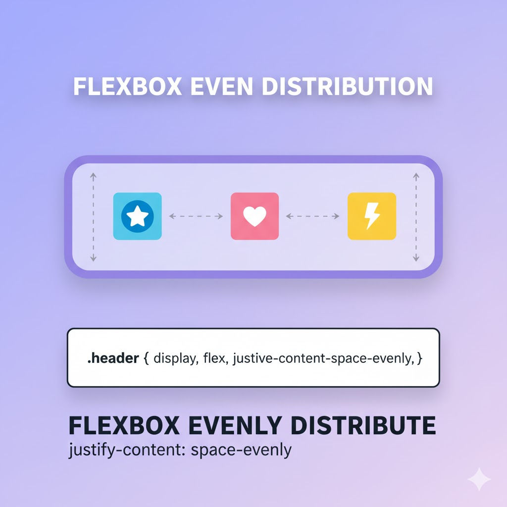
Method 3: Using justify-content: space-evenly
.site-header {
  display: flex;
  justify-content: space-evenly;
  align-items: center;
}
Why This Is Powerful
- Equal space between and around all elements
- Clean, symmetrical layout
Browser Support
- Supported in all modern browsers
Use Case
When visual symmetry matters more than strict alignment.
Method 4: Perfect Center Alignment Using Flex-Grow
If you want the center element to stay perfectly centered, regardless of left and right widths:
CSS
.site-header {
  display: flex;
  align-items: center;
}

.header-left,
.header-right {
  flex: 1;
}

.header-center {
  flex: 0;
  text-align: center;
}
How It Works
- Left and right take equal space
- Center stays exactly in the middle
Ideal For
- Logos + centered menus
- Professional navigation bars
Method 5: Equal Width Columns with flex: 1
To distribute all three elements evenly by width:
.site-header {
  display: flex;
  align-items: center;
}

.site-header > div {
  flex: 1;
  text-align: center;
}
Result
- Each section occupies exactly one-third of the header
- Very clean and predictable
Common Use Case
- Dashboards
- Admin panels
- Toolbars
Method 6: Centered Navigation with Absolute Positioning + Flexbox
For complex headers where center must remain fixed:
.site-header {
  display: flex;
  align-items: center;
  position: relative;
}

.header-center {
  position: absolute;
  left: 50%;
  transform: translateX(-50%);
}
Use Case
- Large enterprise headers
- Heavy left/right content
Responsive Example with Media Queries
Flexbox adapts well to mobile layouts.
@media (max-width: 768px) {
  .site-header {
    flex-direction: column;
    gap: 12px;
  }
}
Result
- Desktop: horizontal layout
- Mobile: stacked elements
Complete Example (Production-Ready)
HTML
<header class="site-header">
  <div class="header-left">
    <img src="logo.png" alt="Logo">
  </div>

  <nav class="header-center">
    <a href="#">Home</a>
    <a href="#">About</a>
    <a href="#">Contact</a>
  </nav>

  <div class="header-right">
    <button>Login</button>
  </div>
</header>
CSS
.site-header {
  display: flex;
  justify-content: space-between;
  align-items: center;
  padding: 16px 24px;
  background-color: #ffffff;
  border-bottom: 1px solid #ddd;
}

.header-center a {
  margin: 0 10px;
  text-decoration: none;
}
Accessibility Best Practices
- Use semantic elements (
<header>,<nav>) - Ensure focus order remains logical
- Avoid absolute positioning unless necessary
- Maintain keyboard navigation support
Common Mistakes to Avoid
❌ Using margins instead of Flexbox spacing
❌ Forgetting align-items: center
❌ Overcomplicating with floats or tables
❌ Not testing responsive behavior
❌ Mixing Flexbox with unnecessary positioning
Flexbox vs CSS Grid for Headers
| Feature | Flexbox | Grid |
|---|---|---|
| One-dimensional layout | ✅ | ❌ |
| Simple alignment | ✅ | ⚠️ |
| Responsive headers | ✅ | ✅ |
| Complex layouts | ❌ | ✅ |
For three elements in a header, Flexbox is usually the best choice.
Interview-Ready Short Answer
You can evenly distribute three elements inside a header using Flexbox by setting display: flex on the header and using justify-content values like space-between, space-around, or space-evenly. For perfect centering, assign equal flex values to the left and right elements while keeping the center element fixed.
Conclusion
Flexbox provides multiple clean and scalable ways to evenly distribute three elements inside a header. Whether you want equal spacing, perfect centering, or equal widths, Flexbox offers a solution that is responsive, readable, and production-ready.
By understanding how justify-content, align-items, and flex properties work together, developers can build professional header layouts that adapt smoothly across devices.


