How can you add a semi-transparent overlay on top of a background image?
Absolutely! Let’s break this down comprehensively. Adding a semi-transparent overlay over a background image is a common design technique in web development. It’s often used to make text more readable on top of images, create visual depth, or enhance user interface aesthetics. I’ll explain it in detail, step by step, with multiple approaches, examples, and practical tips.
Introduction
When designing modern websites, images are often used as backgrounds to create visually appealing sections. However, placing text or UI elements directly on a background image can make the content hard to read. A semi-transparent overlay can help by dimming or coloring the background slightly while maintaining the image visibility.
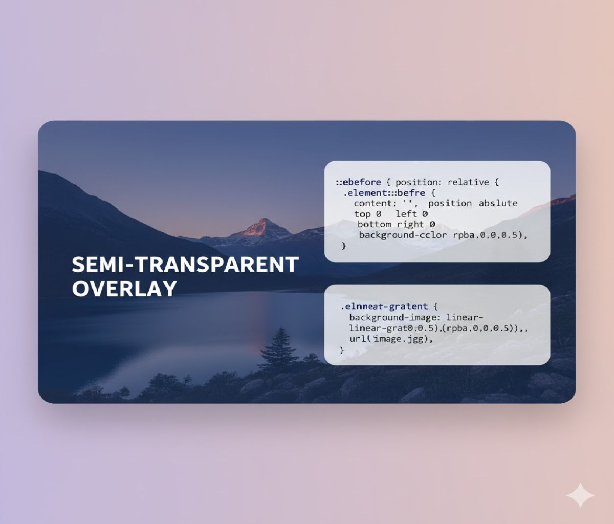
Approach 1: Using a Pseudo-Element (::before or ::after)
One of the most common techniques is using CSS pseudo-elements to create an overlay. This method doesn’t require extra HTML elements and is clean.
HTML Structure
<div class="hero-section">
  <h1>Welcome to Our Website</h1>
  <p>Enhancing readability with a semi-transparent overlay</p>
</div>
CSS
.hero-section {
  position: relative;
  background-image: url('background.jpg');
  background-size: cover;
  background-position: center;
  height: 500px;
  color: white;
  display: flex;
  flex-direction: column;
  justify-content: center;
  align-items: center;
  text-align: center;
}

.hero-section::before {
  content: "";
  position: absolute;
  top: 0;
  left: 0;
  width: 100%;
  height: 100%;
  background-color: rgba(0, 0, 0, 0.5); /* Semi-transparent black */
  z-index: 1;
}

.hero-section h1,
.hero-section p {
  position: relative;
  z-index: 2; /* Make text appear above overlay */
}
Explanation:
::beforecreates a pseudo-element that covers the entire.hero-section.rgba(0,0,0,0.5)creates a black overlay with 50% opacity.position: relativeon.hero-sectionensures the overlay is positioned relative to the container.z-indexensures the text appears above the overlay.
Result: A semi-transparent overlay on the background image, making text readable.
Approach 2: Using a Separate Overlay <div>
Sometimes, you may want more flexibility, like applying animations or multiple overlays. In that case, you can add a separate HTML element.
HTML
<div class="hero-section">
  <div class="overlay"></div>
  <h1>Welcome to Our Website</h1>
  <p>Enhancing readability with a semi-transparent overlay</p>
</div>
CSS
.hero-section {
  position: relative;
  background-image: url('background.jpg');
  background-size: cover;
  background-position: center;
  height: 500px;
  color: white;
  display: flex;
  flex-direction: column;
  justify-content: center;
  align-items: center;
  text-align: center;
}

.hero-section .overlay {
  position: absolute;
  top: 0;
  left: 0;
  width: 100%;
  height: 100%;
  background-color: rgba(0, 0, 0, 0.5); /* Semi-transparent black */
  z-index: 1;
}

.hero-section h1,
.hero-section p {
  position: relative;
  z-index: 2;
}
Advantages of this method:
- Easy to manipulate with JavaScript.
- Can apply animations to the overlay.
- Multiple overlays can be stacked for complex effects.
Approach 3: Using linear-gradient with background-image
CSS allows combining gradients and images. You can apply a semi-transparent gradient directly as the background.
HTML
<div class="hero-section">
  <h1>Welcome to Our Website</h1>
  <p>Enhancing readability with a semi-transparent overlay</p>
</div>
CSS
.hero-section {
  height: 500px;
  display: flex;
  flex-direction: column;
  justify-content: center;
  align-items: center;
  text-align: center;
  color: white;

  background: linear-gradient(rgba(0,0,0,0.5), rgba(0,0,0,0.5)),
              url('background.jpg') center/cover no-repeat;
}
Explanation:
linear-gradient(rgba(0,0,0,0.5), rgba(0,0,0,0.5))creates a uniform semi-transparent overlay.- The gradient is placed on top of the background image.
- This method requires no extra elements or pseudo-elements.
- Can create more advanced effects by adjusting gradient directions and colors.
Approach 4: Using background-blend-mode
CSS background-blend-mode allows blending a background color with an image.
HTML
<div class="hero-section">
  <h1>Welcome to Our Website</h1>
</div>
CSS
.hero-section {
  height: 500px;
  display: flex;
  justify-content: center;
  align-items: center;
  color: white;
  text-align: center;

  background-image: url('background.jpg'), rgba(0, 0, 0, 0.5);
  background-size: cover;
  background-position: center;
  background-blend-mode: overlay; /* or multiply, darken */
}
Explanation:
background-blend-mode: overlay;blends the semi-transparent black color with the image.- Allows for artistic effects without extra elements.
- Works well for modern UI design and hero sections.
Choosing the Right Color and Opacity
- Use
rgba()to create semi-transparent colors. rgba(0,0,0,0.5)= black at 50% opacity.rgba(255,255,255,0.3)= white at 30% opacity.- Adjust opacity based on image brightness and text readability.
Tip: Darker overlays work better for light text, while lighter overlays suit dark text.
Adding Animations to Overlays
Overlay elements can be animated to create visual interest.
.overlay {
  position: absolute;
  top: 0;
  left: 0;
  width: 100%;
  height: 100%;
  background-color: rgba(0,0,0,0.5);
  z-index: 1;
  transition: background-color 0.5s ease;
}

.hero-section:hover .overlay {
  background-color: rgba(0,0,0,0.7); /* Darker on hover */
}
- Provides a subtle interaction effect.
- Enhances user engagement.
Making Overlays Responsive
For responsive designs, ensure the overlay covers the container regardless of screen size.
.hero-section {
  width: 100%;
  min-height: 300px;
  display: flex;
  flex-direction: column;
  justify-content: center;
  align-items: center;
  position: relative;
  text-align: center;
  color: white;
  background-image: url('background.jpg');
  background-size: cover;
  background-position: center;
}

.hero-section .overlay {
  position: absolute;
  inset: 0; /* shorthand for top:0; right:0; bottom:0; left:0; */
  background-color: rgba(0,0,0,0.5);
}
inset: 0ensures full coverage.- Overlay automatically adapts to responsive container sizes.
SEO and Accessibility Considerations
- Overlay elements should not interfere with content for screen readers.
- Keep text inside the overlay container accessible.
- Avoid using images with text; use HTML text over overlays instead.
- Optimize background images for faster loading.
Summary of Methods
| Method | Pros | Cons |
|---|---|---|
Pseudo-element (::before) | Clean HTML, easy to implement | Less flexible for animations |
Separate <div> overlay | Animatable, multiple overlays | Extra HTML element |
linear-gradient in background | No extra elements, simple | Limited flexibility for complex shapes |
background-blend-mode | Artistic blending effects | Browser support may vary slightly |
Full Example: Hero Section with Semi-Transparent Overlay
<!DOCTYPE html>
<html lang="en">
<head>
<meta charset="UTF-8">
<meta name="viewport" content="width=device-width, initial-scale=1.0">
<title>Semi-Transparent Overlay Example</title>
<style>
  body {
    margin: 0;
    font-family: Arial, sans-serif;
  }

  .hero-section {
    position: relative;
    height: 500px;
    background-image: url('background.jpg');
    background-size: cover;
    background-position: center;
    color: white;
    display: flex;
    flex-direction: column;
    justify-content: center;
    align-items: center;
    text-align: center;
  }

  .hero-section::before {
    content: "";
    position: absolute;
    inset: 0;
    background-color: rgba(0,0,0,0.5);
    z-index: 1;
  }

  .hero-section h1,
  .hero-section p {
    position: relative;
    z-index: 2;
  }

  .hero-section p {
    font-size: 1.2rem;
  }
</style>
</head>
<body>

<div class="hero-section">
  <h1>Welcome to Our Website</h1>
  <p>Enhancing readability with a semi-transparent overlay</p>
</div>

</body>
</html>
✅ Key Takeaways:
- Semi-transparent overlays improve text readability over images.
- Can be created using pseudo-elements, additional
<div>, gradients, or blend modes. rgba()andopacityare essential for controlling transparency.- Always ensure overlays are responsive and accessible.
- Can be enhanced with animations for interactive designs.


