Android 17 on Pixel to Feature New Blur Design in System UI
Google Expands Blur Effects Across Android 17 System UI on Pixel Devices
Google is preparing to refine the visual experience of Android once again, this time by significantly expanding the use of blur effects throughout the system interface in Android 17. While the update is not expected to introduce a sweeping redesign on the scale of last year’s Material 3 Expressive overhaul, early builds indicate that the company is leaning further into translucency and layered depth as core elements of its design language.
Based on internal versions of Android 17 that have surfaced, Google is incorporating noticeably more blur into system UI components. System flags reportedly refer directly to this new visual treatment as “blur,” suggesting that the change is intentional and coordinated rather than experimental. The update represents an evolution of design choices introduced in earlier releases and reflects Google’s broader effort to modernize Android’s visual identity without disrupting its familiar layout and functionality.
Building on Material 3 Expressive
In 2025, Google rolled out Material 3 Expressive, a bold refinement of its Material Design system that emphasized larger touch targets, stronger typography, fluid animations, and dynamic color personalization. That redesign significantly refreshed Android’s look and feel, particularly on Pixel devices, but it maintained a foundation rooted in solid color surfaces and clearly separated UI layers.
Android 17 does not discard that foundation. Instead, it builds on it by introducing greater translucency. Rather than presenting system overlays with flat light or dark backgrounds, many elements will now use blurred surfaces that allow underlying content to remain partially visible. The change enhances visual continuity and depth while preserving the structural layout users are accustomed to.
Blur Expands Beyond Notifications
Google first experimented with subtle background blur in Android 16 QPR1. In that release, the notification shade and Quick Settings panel adopted a lightly blurred background instead of a fully opaque one. At the time, Google explained that the effect provided a “sense of depth,” helping motion feel lighter while keeping users aware of apps running in the background.
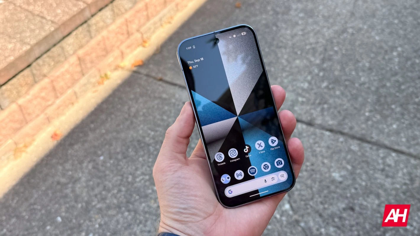
Android 17 extends this concept much further. Instead of limiting blur to notifications and Quick Settings, the company appears to be applying it across multiple system components. Among the most visible changes is the volume interface. The pill-shaped container that houses the volume slider, mode toggles, and related controls will become translucent. When users adjust volume on the home screen, they will see their wallpaper and icons softly blurred behind the overlay. Inside apps, the content beneath the slider remains faintly visible.
Other elements, such as the expanded volume sheet and power menu, are also expected to feature similar blur treatments. These panels will appear less like solid sheets covering the display and more like floating layers integrated into a cohesive visual environment.
Integration with Dynamic Color
A key detail in Android 17’s approach is that blur effects will be tinted using the Dynamic Color system. Introduced as part of Material You, Dynamic Color extracts hues from the user’s wallpaper and applies them across system elements for a personalized theme.
In Android 17, the blurred panels will not simply be neutral frosted glass. Instead, they will inherit tones from the wallpaper-based color palette, ensuring that translucency complements the user’s aesthetic choices. This maintains consistency with Google’s personalization strategy while preventing blur from feeling generic or disconnected from the broader interface.
A Subtle Shift Compared to iOS
Blurred interfaces inevitably draw comparisons to Apple’s iOS, which has long embraced translucency. Apple’s design language frequently incorporates glass-like panels, layered transparency, and dynamic reflections. More recent iterations have intensified that aesthetic with more pronounced “liquid” effects.
Android 17’s interpretation appears far more restrained. Rather than dramatic glass surfaces or reflective animations, Google is opting for understated background blur. The goal seems to be enhancing depth without introducing visual distraction. This measured approach aligns with Material Design’s longstanding emphasis on clarity and usability.
Technical Considerations and Performance
The expansion of blur across Android raises technical questions, particularly regarding performance and efficiency. Real-time blur requires additional graphical processing, especially when combined with animations and dynamic color overlays. Rendering blurred backgrounds smoothly across different hardware configurations can be demanding.
Pixel devices, which are designed in-house by Google, offer tighter hardware-software integration. This likely gives Google greater confidence in deploying visual enhancements without compromising responsiveness. Optimizations at the system level may ensure that blur effects remain fluid even during multitasking or high-load scenarios.
Battery consumption is another factor. While modern chipsets are efficient, sustained graphical effects could theoretically increase energy usage. Google’s gradual rollout suggests that performance testing has been a priority, particularly given the company’s focus on improving battery longevity in recent Pixel releases.
Accessibility and Readability
Accessibility remains a central consideration in any design change. Blur can enhance aesthetics but may also reduce contrast if not carefully calibrated. Users with visual impairments rely on strong contrast and clear separation between foreground and background elements.
Android has historically provided robust accessibility options, including high-contrast modes, color correction, and display scaling. It is expected that Android 17 will maintain similar controls, potentially adjusting blur intensity or opacity based on accessibility settings. Ensuring readability while adopting translucency will be essential to maintaining inclusivity.
Implications for Third-Party Apps
One open question is whether blur will remain limited to system UI components or expand into third-party applications. Currently, Material 3 Expressive guidelines do not emphasize blur as a primary design pattern for apps. Most applications continue to use solid surfaces, adaptive colors, and shape-based layering.
If Android’s system UI increasingly embraces translucency while apps remain flat, the visual experience could feel inconsistent. Alternatively, Google may intentionally reserve blur for system-level elements to distinguish OS controls from app content. This would reinforce a hierarchy where system overlays appear as lightweight layers separate from application interfaces.
Should Google choose to incorporate blur into future Material guidelines, developers may receive APIs and tools to implement similar effects. Such a move would represent a broader shift in Android’s visual ecosystem, potentially influencing thousands of apps.
Strategic Positioning and Market Impact
In the competitive smartphone market, design plays a growing role in differentiation. Hardware performance across flagship devices has become increasingly similar, and software experience is often the deciding factor for consumers. Visual identity, fluid interactions, and cohesive theming contribute significantly to brand perception.
By expanding blur in Android 17, Google is aligning its platform with contemporary design trends while preserving its distinctive Material foundation. The move signals that Android is evolving in step with broader industry aesthetics without abandoning its usability principles.
For Pixel devices in particular, these refinements strengthen Google’s vertical integration strategy. Pixels serve as reference devices for Android’s intended experience. By introducing blur enhancements first on Pixels, Google can showcase a polished, cohesive vision of its operating system.
Evolution Rather Than Revolution
Android 17 does not appear to introduce major structural changes to navigation, layout, or feature sets. Instead, it refines what already exists. The interface largely looks and functions the same as before. Buttons remain where users expect them. Gestures operate consistently. The overall architecture is unchanged.
This incremental philosophy reflects the maturity of mobile operating systems. Radical redesigns can disrupt user habits and introduce friction. Subtle refinements, on the other hand, allow platforms to modernize while maintaining familiarity.
In this context, blur becomes a tool for polish rather than transformation. It softens transitions, reduces visual harshness, and creates continuity between tasks. Users may not immediately identify blur as the defining feature of Android 17, but over time they may notice that interactions feel lighter and more fluid.
Looking Ahead
As Android 17 moves closer to official release, additional details are likely to emerge. Observers will watch to see how widely blur is implemented and whether developers receive guidance on adopting similar treatments.
The update also hints at the future direction of Material Design. Google may continue layering refinements over time, gradually shifting toward a more immersive, depth-oriented aesthetic. Rather than periodic overhauls, Android may evolve through steady visual adjustments that collectively reshape its identity.
For now, Android 17’s expanded blur effects represent a measured step forward. They enhance depth without overwhelming users. They modernize the interface without redefining it. And they reflect Google’s commitment to incremental improvement in a mature and competitive ecosystem.
In an era where smartphone platforms are defined as much by subtlety as by innovation, Android 17 demonstrates that even small design adjustments can have meaningful impact. By adding carefully calibrated translucency across system UI elements, Google is refining the Android experience—making it feel lighter, more cohesive, and quietly more sophisticated.